
The site has a new design. The goal: let the work and the aircraft speak, and get everything else out of the way.
What changed
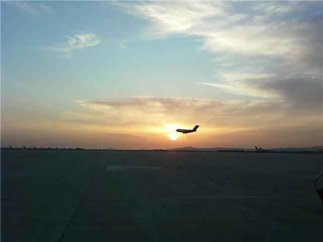
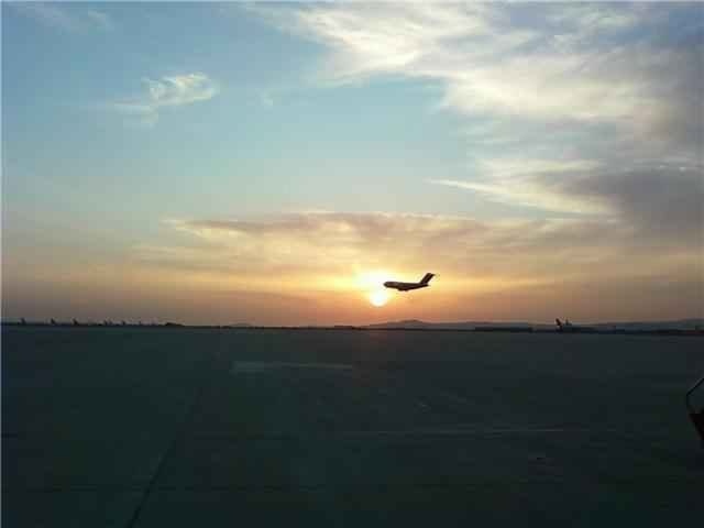
- Photography first. Every image on the site is an AviationDevy photograph — flight lines, flight decks, research aircraft and spacecraft exhibits. See them all in Field notes.
- One palette. Midnight navy, off-white type, the brand blue for anything you can click, and a warm amber borrowed from cockpit lighting.
- Fewer, bigger ideas. Each section makes one point, in large type, with room to breathe.
- The product stays centre stage. The flight-data chart on the home page is still the real analysis component, rendering a sample flight live.
What didn't
Flight Data Analysis, Airline Systems and Aircraft Systems work exactly as before — same workspace, same reports.